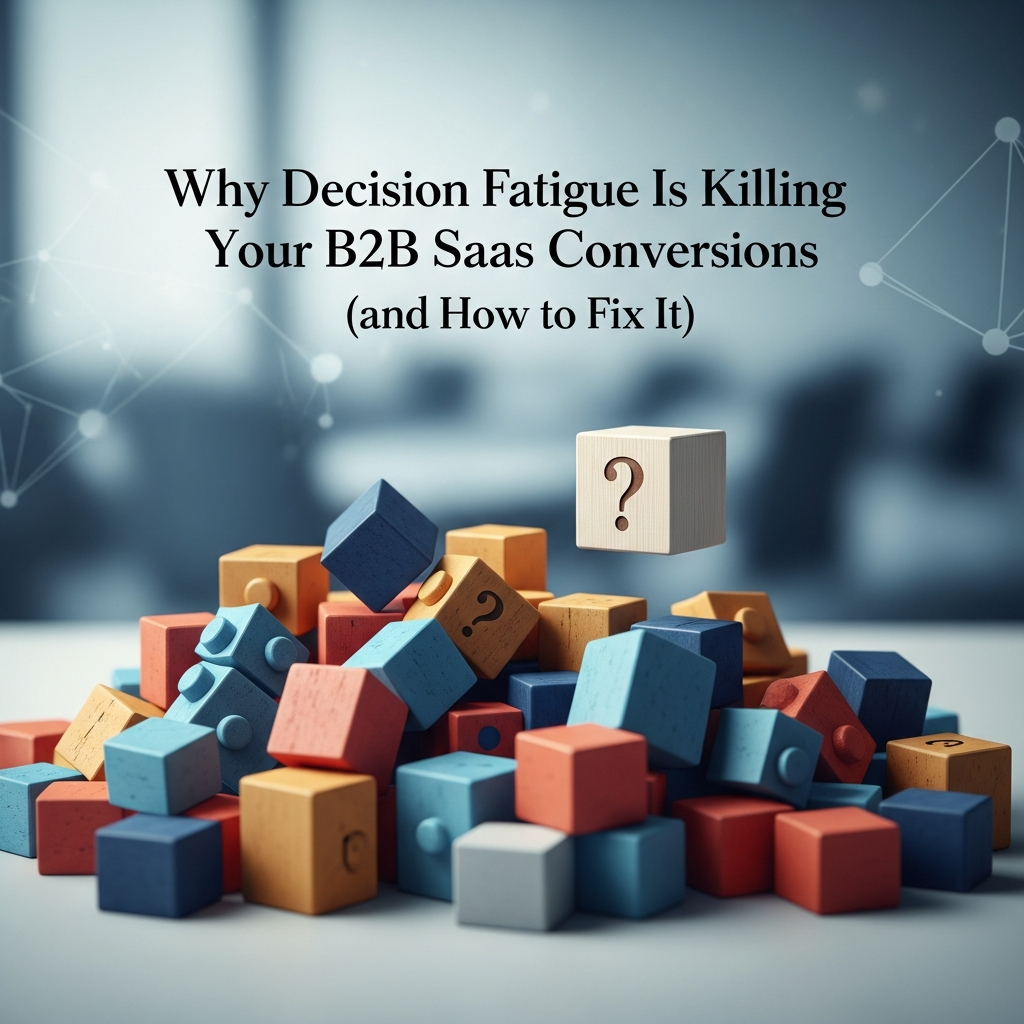
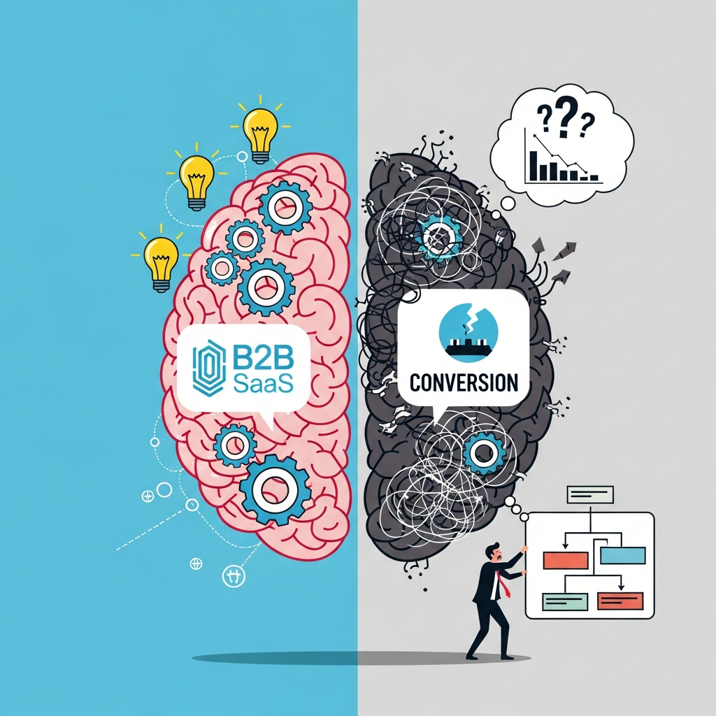
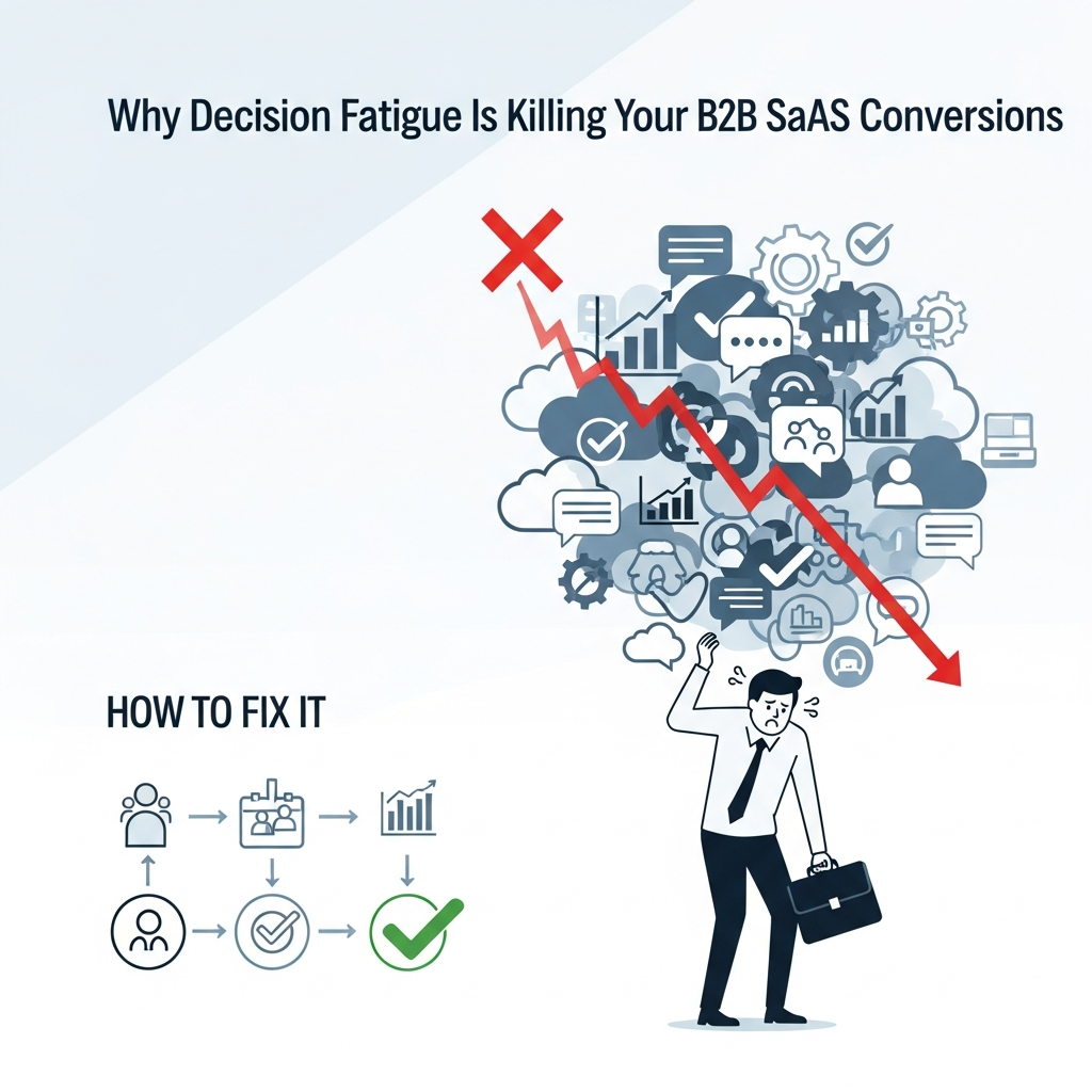
The Hidden Cognitive Tax: Why Your Prospects Are Ghosting You
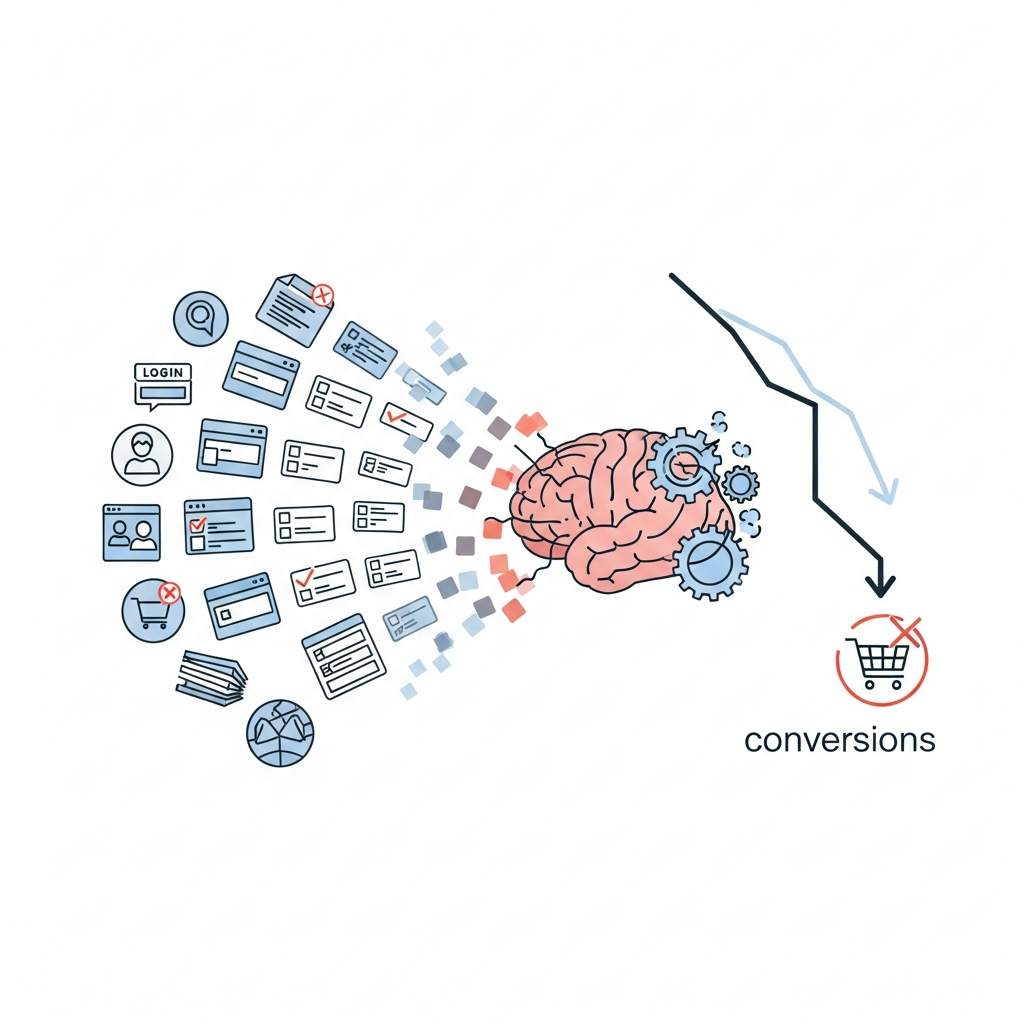
It is 3:17 PM on a Tuesday. Your ideal customer—let’s call him Marcus, a VP of Engineering at a mid-market fintech firm—has just finished his fifth back-to-back meeting. He is running on lukewarm coffee and the fumes of a dwindling attention span. He clicks your ad. He lands on your “Features” page. He is greeted by a sprawling grid of 45 different capabilities, three distinct pricing tiers with “Contact Us” buttons scattered like digital confetti, and a chatbot that pops up asking if he’d like a “quick whitepaper.”
Marcus doesn’t sign up. He doesn’t even bookmark the page. He closes the tab with a heavy sigh. It’s not that your software isn’t good. It might be revolutionary. But in that moment, Marcus wasn’t suffering from a lack of interest. He was suffering from decision fatigue. His brain simply ran out of the metabolic fuel required to process one more choice. And in the high-stakes world of B2B SaaS, where the sales cycles are long and the stakeholders are many, decision fatigue is the silent killer of conversions.
The Neurobiology of the “No”: What’s Happening Under the Hood
To understand why your conversion rate is hovering at a dismal 2%, we have to look at the prefrontal cortex. This is the executive center of the brain. It handles logic, planning, and—crucially—decision-making. Here’s the catch: the prefrontal cortex is incredibly energy-intensive. Unlike our primal “lizard brain” which can run on autopilot for days, the executive brain has a finite battery.
In the academic world, this is often referred to as Ego Depletion. While the concept has faced some replication debates, the core psychological reality remains: making choices wears us down. Every time you ask a prospect to choose between “Starter” and “Growth,” or “See Demo” vs. “Start Free Trial,” you are making a withdrawal from their cognitive bank account. If the balance hits zero before they reach the “Thank You” page, you lose. It’s a binary outcome driven by biological exhaustion.
Hick’s Law and the Paradox of Choice
You’ve likely heard of Hick’s Law. It’s a staple of UX design. It states that the time it takes for a person to make a decision increases logarithmically with the number and complexity of choices. But in B2B SaaS, we often ignore this in favor of “feature-rich” marketing. We think more features equals more value. Psychology says the opposite. Barry Schwartz, in his seminal work The Paradox of Choice, argues that an abundance of options actually leads to anxiety and indecision. For your prospect, a crowded pricing page isn’t an opportunity; it’s a threat to their mental peace.
The B2B Context: A Multi-Layered Fatigue
Decision fatigue in B2C is simple. Do I buy the blue shoes or the red shoes? If I pick wrong, I lose fifty bucks. In B2B SaaS, the stakes are tectonic. If Marcus chooses the wrong CRM, he’s not just out of a few thousand dollars; he’s potentially responsible for a failed implementation that costs his company millions and stains his career. This adds a layer of anticipatory regret to the decision fatigue. He isn’t just tired; he’s scared of being tired and wrong.
Furthermore, B2B decisions are rarely made in a vacuum. We’re talking about “Buying Committees.” Now, you aren’t just dealing with Marcus’s decision fatigue; you’re dealing with the collective fatigue of Marcus, the CFO, the Head of Security, and the end-users. Every friction point in your funnel is a moment where the committee can collectively decide that it’s simply “too much work” to move forward.
Where SaaS Companies Get It Wrong (The Usual Suspects)
I’ve spent a decade auditing SaaS funnels, and the same patterns emerge like clockwork. We are our own worst enemies. We love our products so much that we want to show every bell and whistle on the first date. It’s the digital equivalent of a first date showing you their entire 20-year career plan before the appetizers arrive. It’s overwhelming.
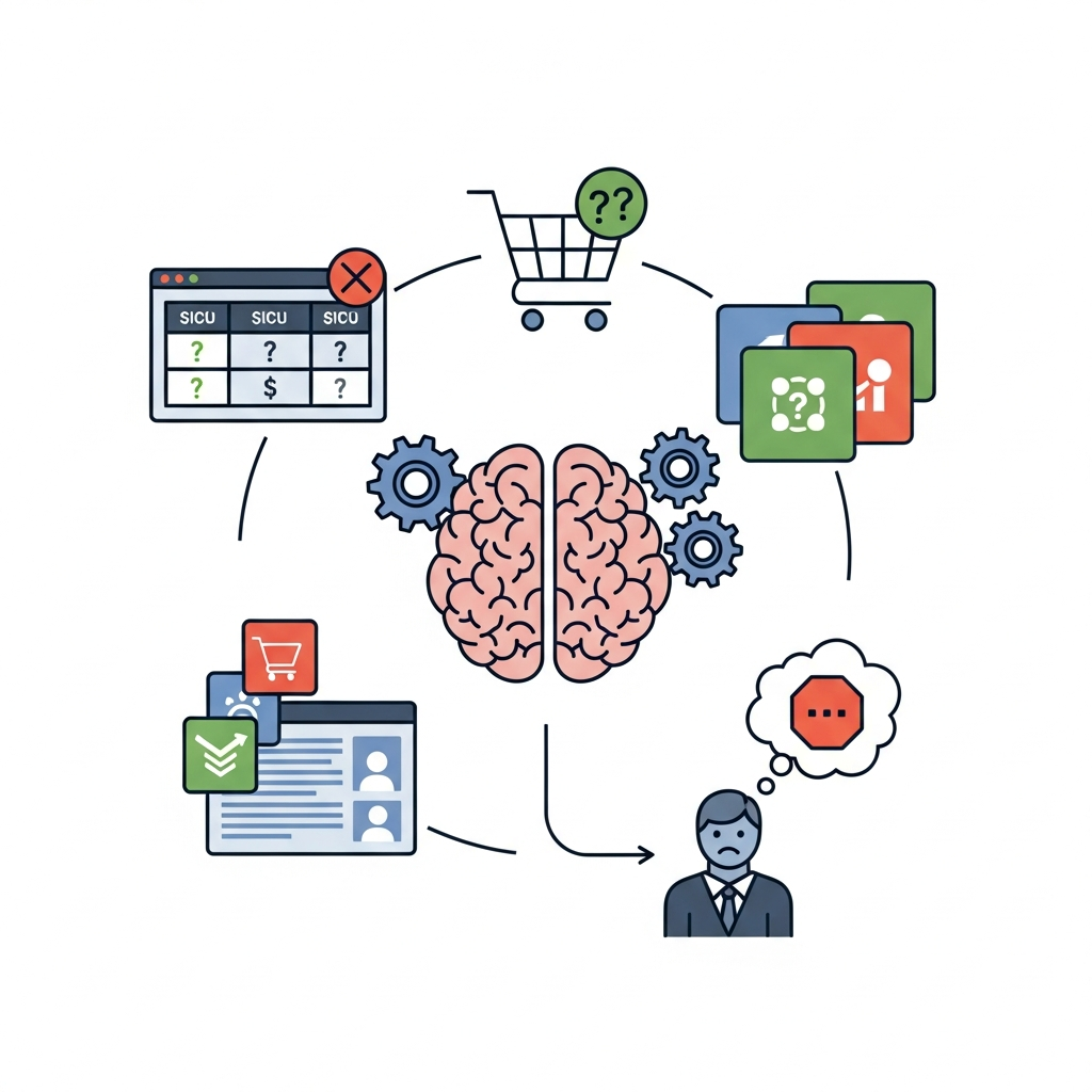
1. The “Kitchen Sink” Pricing Page
If your pricing page requires a PhD to decode, you’ve already lost. I see companies with seven different tiers, each with a 20-item checklist of “included” vs. “excluded” features. The prospect looks at this and realizes they have to spend 45 minutes doing a gap analysis just to figure out which version they need. Result? They decide to “think about it.” And in SaaS, “I’ll think about it” is the graveyard where deals go to die.
2. The CTA Identity Crisis
Look at your homepage right now. How many primary buttons do you have? “Request a Demo,” “Start for Free,” “Watch Video,” “Talk to Sales.” Each of these is a different cognitive path. By offering four doors, you’re forcing the user to stop and evaluate which door is the right one. This micro-evaluation is a friction point. It creates a stutter in the user’s flow. You want a slip-and-slide, not a hurdle race.
3. Progressive Disclosure (Or Lack Thereof)
The onboarding process is often the worst offender. Most SaaS platforms dump the user into a dashboard that looks like a NASA control center. The user wanted to solve one problem—say, sending an automated email—but now they have to set up integrations, invite team members, and configure their “workspace.” This is cognitive overload at the most critical juncture of the customer journey.
>How to Fix It: Engineering the Path of Least Resistance
Fixing decision fatigue isn’t about removing options; it’s about curating them. You need to act as a sherpa, not a librarian. A librarian shows you where the books are. A sherpa tells you exactly where to step so you don’t fall off the mountain. Here is the blueprint for a low-fatigue B2B SaaS funnel.
The “Power of One” Strategy
Every page on your site should have exactly one goal. One. If it’s your landing page for a specific ad campaign, the only thing the user should be able to do is the thing you paid for them to do. Remove the navigation bar. Kill the footer links. Eliminate the “Related Blog Posts.” If you want them to book a demo, make the “Book a Demo” button the only logical exit point. This reduces the choice set to a binary: Do I want this or not? Binary decisions are much easier on the brain than multivariate ones.
Opinionated Onboarding
Stop asking users how they want to set up their account. Tell them. Deploy “Opinionated UX.” Use templates that are 90% pre-configured based on their industry. If they are a marketing agency, their dashboard should already look like a marketing agency’s dashboard. By providing a default state, you harness the power of the Status Quo Bias. People are much more likely to stick with a pre-set option than they are to build one from scratch.
Tiered Pricing for Humans, Not Robots
Limit your pricing to three tiers. Why three? Because it allows for Price Anchoring. You have the “Basic” (too small), the “Enterprise” (too expensive for most), and the “Professional” (the ‘Goldilocks’ choice). Most users will naturally gravitate toward the middle. By highlighting the middle tier as “Most Popular,” you provide a social heuristic. You’re telling the prospect, “People like you usually pick this.” You’ve just done the hard work of decision-making for them.
>The Power of “Progressive Disclosure”
This is a concept borrowed from human-computer interaction (HCI). It’s the idea of only showing information when it is absolutely necessary. Don’t show the advanced reporting features until the user has successfully completed their first basic task. In your sales deck, don’t talk about your SOC2 compliance in slide two unless you’re talking to the CISO. For the Marketing Manager, that’s just extra noise that drains their battery.
Think of it like a video game. You don’t get the “Ultimate Sword” at Level 1. You get a wooden stick. You learn to swing the stick. Then you get a shield. If you gave a Level 1 player the entire inventory, they’d quit the game out of sheer confusion. Your SaaS is the same. Drip-feed the complexity.
>Using Social Proof as a Cognitive Shortcut
Social proof isn’t just about showing off; it’s about reducing the perceived risk of a decision. When Marcus sees that three of his competitors use your software, his brain can offload the “Is this safe?” calculation. He thinks, “If it works for them, it’ll work for me.” You’ve just bypassed a massive amount of analytical heavy lifting. But be careful—don’t overwhelm him with fifty logos. Show him the three most relevant logos. Again, curation is king.
>The “Default” Effect: Why Less Is More in Configuration
I recently worked with a DevOps tool that had a 12-step setup process. Conversion was in the gutter. We changed the setup so that the tool automatically detected the user’s environment and pre-filled 10 of the 12 steps. The user just had to click “Confirm.” Conversions jumped by 40% overnight. We didn’t change the product’s value. We just stopped asking the user to make 12 decisions when they only really cared about one: “Does this work?”
>The Role of Empathetic Copywriting
Your copy should acknowledge the fatigue. Instead of “Our platform offers robust multi-channel orchestration,” try “Stop jumping between 10 different tabs. Manage everything in one place.” The first sentence is a feature that requires mental translation. The second is a relief of cognitive burden. It speaks directly to the pain of the fatigued brain. Support your user. Be the aspirin, not the headache.
A Quick Checklist for Auditing Your Funnel
- The 5-Second Test: Can a user identify exactly what they should do next within 5 seconds of landing on your page?
- CTA Density: Do you have more than two different primary calls-to-action on your homepage? (If yes, kill one).
- Pricing Clarity: Can a prospect figure out their likely monthly cost without talking to a human?
- Onboarding Friction: How many clicks does it take from “Sign Up” to “Aha Moment”? If it’s more than five, you have a problem.
>The Strategic Advantage of Simplicity
In the “Feature Wars” of the SaaS world, simplicity is the ultimate weapon. Everyone is trying to be the “all-in-one” solution. But “all-in-one” often translates to “everything-is-confusing.” If you can be the company that makes the decision easy, you will win. Not because your code is better, but because your user experience respects the biological limits of the human brain.
Look, I get it. You’ve worked hard on those features. Your engineers are proud of them. Your investors want to see “Enterprise” readiness. But none of that matters if Marcus closes the tab because his brain is too tired to figure out how to buy from you. Reduce the options. Clear the path. Make the “Yes” the easiest thing he does all day.
It’s not just about conversion optimization; it’s about empathy. It’s about recognizing that on the other side of that screen is a tired, stressed-out human being who just wants their problems to go away. If you can be the one who doesn’t add to their mental load, they won’t just buy your software—they’ll thank you for it.
>Final Thoughts for the Over-Thinkers
If you take nothing else from this, remember: Constraints are a gift to your customer. By limiting what they can do, you are guiding them toward what they should do. In the crowded, noisy, exhausting landscape of B2B SaaS, the brand that provides the most clarity—not the most features—is the one that scales. Stop making your prospects think so hard. They’re already tired enough.